ML for Beginner 2-4 Regression-Logistic

이번 Lesson에서는 코드를 위주로 정리해본다.
특정 Column들만 냄기고 결측치를 제거한다.
columns_to_select = ['City Name', 'Package', 'Variety', 'Origin', 'Item Size', 'Color']
pumpkins = full_pumpkins.loc[:,columns_to_select]

pumpkins.dropna(inplace=True)
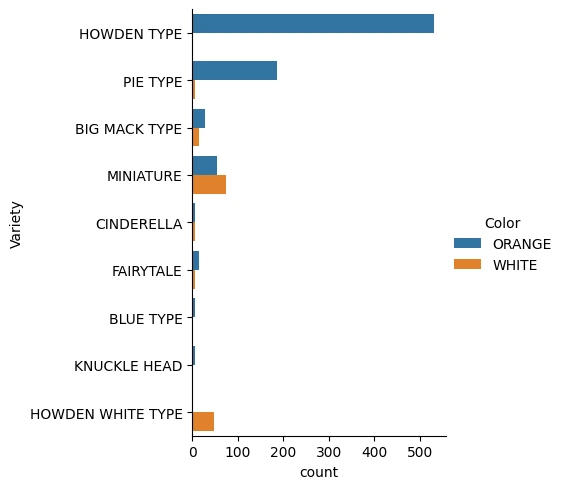
seaborn의 count 타입 category plot을 그려 각 Variety별로 색상의 분포를 파악한다.
import seaborn as sns

palette = {
  'ORANGE': 'orange',
  'WHITE': 'wheat',
}

sns.catplot(
  data=pumpkins,y='Variety', hue='Color', kind='count',palette=palette,
)
데이터 전처리Permalink
Ordinal EncodingPermalink
호박의 크기와 같이 데이터의 범주가 수치와 연관이 있는 경우 그걸 숫자로 변경하는 인코딩 방법이다.
from sklearn.preprocessing import OrdinalEncoder

item_size_categories = [['med', 'lge', 'sml', 'xlge', 'med-lge', 'jbo', 'exjbo']]
ordinal_features = ['Item Size']
ordinal_encoder = OrdinalEncoder(categories=item_size_categories)
med부터 exjbo까지 호박의 크기에 따라 범주가 순서대로 나뉜 것이므로 med=0, sml=2 와 같이 수치로 변경할 수 있다.
이 때, OrdinalEncoder를 이용해 수행해준다.
One-Hot EncodingPermalink
City Name, Package, Variety, Origin 같이 Ordinal하지 않은 범주형 feature들에 대해서는 one-hot encoding을 이용해 전처리해준다.
from sklearn.preprocessing import OneHotEncoder

categorical_features = ['City Name', 'Package', 'Variety', 'Origin']
categorical_encoder = OneHotEncoder(sparse_output=False)
OneHotEncoder를 이용해주면 된다.
이제 ColumnTransformer를 이용해 두 전처리 과정을 합친 Transfomer를 만들어주고 원래 훈련 데이터를 변경해주자.
from pandas import DataFrame
from sklearn.compose import ColumnTransformer

ct = ColumnTransformer(transformers=[
  ('ord', ordinal_encoder, ordinal_features),
  ('cat', categorical_encoder, categorical_features),
])

ct.set_output(transform='pandas')
encoded_features: DataFrame = ct.fit_transform(pumpkins)
여기서 fit_transform은 보통 훈련용 데이터에, transform은 테스트용 데이터에 사용해주며 fit_transform = fit + transform이다.

이런식으로 결과가 나오는데, OrdinalEncoder를 이용해서 인코딩된 feature는 ord__가 붙고, OneHotEncoder를 이용해서 인코딩된 feature엔 cat__가 붙었다.
Label EncodingPermalink
sklearn.preprocessing의 LabelEncoder를 이용해 범주형 값에 부터 시작하는 labelling을 해줄 수 있다.
from sklearn.preprocessing import LabelEncoder

label_encoder = LabelEncoder()
encoded_label = label_encoder.fit_transform(pumpkins['Color'])
이제 DataFrame의 assign함수를 이용해 Color를 우리가 인코딩한 Series로 변경해준다.
encoded_pumpkins = encoded_features.assign(Color=encoded_label)
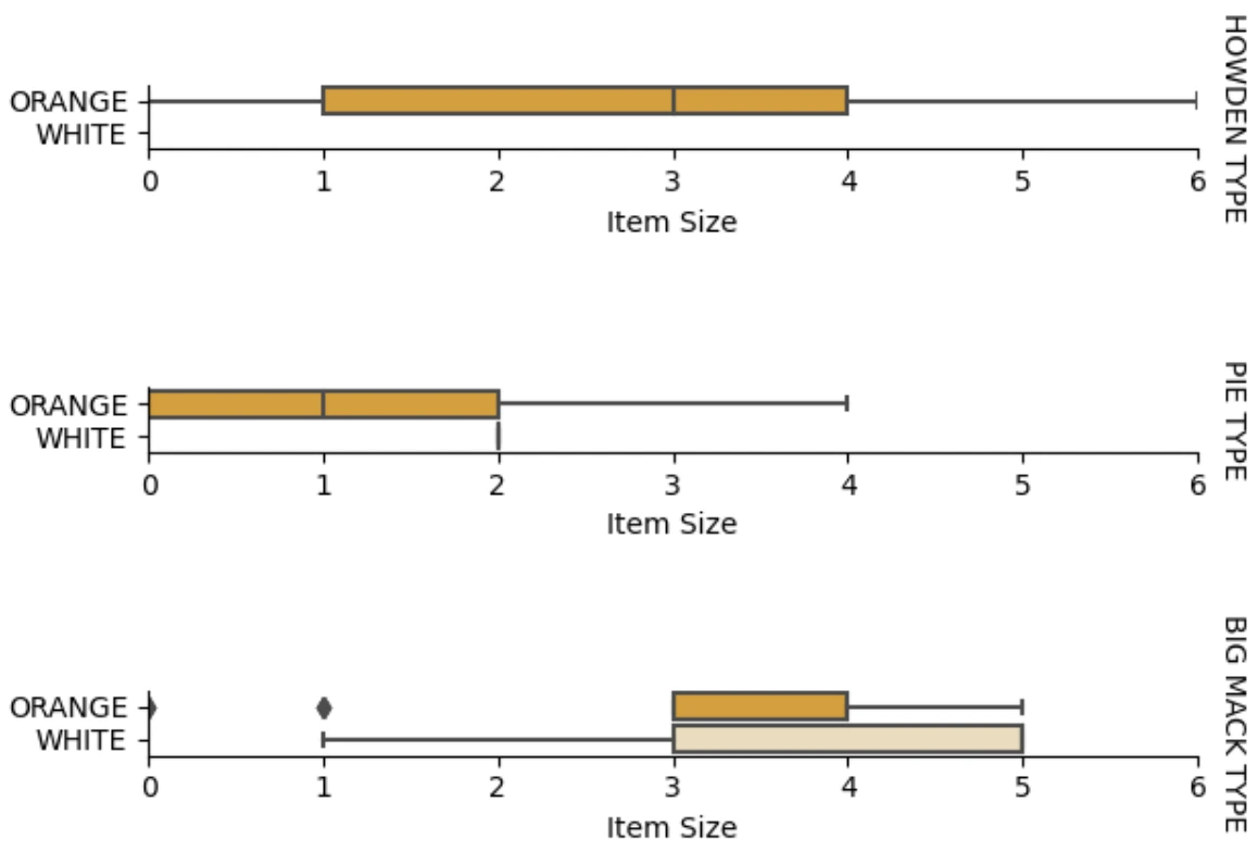
EDAPermalink
이재 Item Size와 Color 간의 관계를 Box Plot으로 Variety에 따라 그리는 작업을 해보자.
이 과정을 통해 우리는 Variety에 따른 Color의 Item Size 분포를 알 수 있다.
    palette = {
    'ORANGE': 'orange',
    'WHITE': 'wheat',
    }
    pumpkins['Item Size'] = encoded_pumpkins['ord__Item Size']

    g = sns.catplot(
        data=pumpkins,
        x="Item Size", y="Color", row='Variety',
        kind="box", orient="h",
        sharex=False, margin_titles=True,
        height=1.8, aspect=4, palette=palette,
    )
    g.set(xlabel="Item Size", ylabel="").set(xlim=(0,6))
    g.set_titles(row_template="{row_name}")
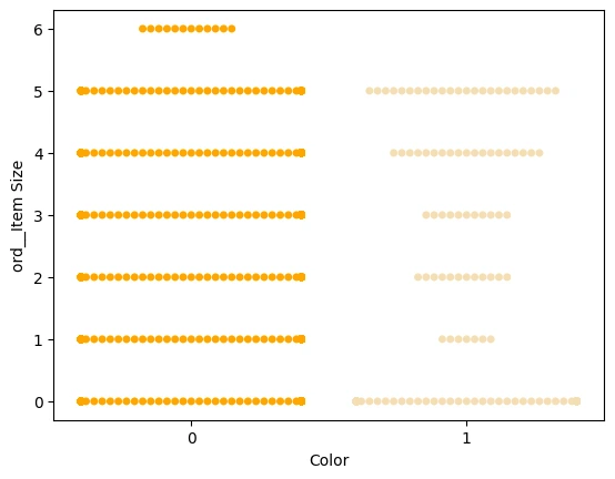
현재 우리가 다루는 데이터에서 Color는 Binary Classification이고 관계를 더 자세히 보기 위해 swarmplot(데이터 점들을 무리지어서 보이게 하는 plot)을 사용해서 볼 수 있다.
scatterplot은 점이 겹치지만 swarmplot은 점이 겹치지 않기 때문에 적은 데이터수에서 용이하게 분포를 잘 파악할 수 있다.
palette = {
	0: 'orange',
	1: 'wheat'
}
sns.swarmplot(x="Color", y="ord__Item Size", data=encoded_pumpkins, palette=palette)
Logistic Regression 의 Sigmoid 함수Permalink
Sigmoid함수는 수치를 로 표현하는 함수로 보통 Binary Classification에서 사용된다.
이 값이 threshold를 넘으면 , 아니면 으로 판단하는 것이다.
Multiclass Classification에선 주로 모든 확률의 합이 이 되도록 만들어주는 Softmax를 쓴다.
모델 학습Permalink
DF에서 X, y 를 분리하고 train_test_split으로 훈련, 테스트 데이터를 분리한다.
from sklearn.model_selection import train_test_split

X = encoded_pumpkins[encoded_pumpkins.columns.difference(['Color'])]
y = encoded_pumpkins['Color']

X_train, X_test, y_train, y_test = train_test_split(X, y, test_size=0.2, random_state=0)
이제 학습시키고 분류의 점수들을 본다.
from sklearn.metrics import f1_score, classification_report
from sklearn.linear_model import LogisticRegression

model = LogisticRegression()
model.fit(X_train, y_train)
predictions = model.predict(X_test)

print(classification_report(y_test, predictions))
print('Predicted labels: ', predictions)
print('F1-score: ', f1_score(y_test, predictions))
                   precision    recall  f1-score   support

                0       0.94      0.98      0.96       166
                1       0.85      0.67      0.75        33

    accuracy                                0.92       199
    macro avg           0.89      0.82      0.85       199
    weighted avg        0.92      0.92      0.92       199

    Predicted labels:  [0 0 0 0 0 0 0 0 0 0 0 0 0 0 0 0 0 0 0 0 1 0 0 1 0 0 0 0 0 0 0 0 1 0 0 0 0
    0 0 0 0 0 1 0 1 0 0 1 0 0 0 0 0 1 0 1 0 1 0 1 0 0 0 0 0 0 0 0 0 0 0 0 0 0
    1 0 0 0 0 0 0 0 1 0 0 0 0 0 0 0 1 0 0 0 0 0 0 0 0 1 0 1 0 0 0 0 0 0 0 1 0
    0 0 0 0 0 0 0 0 0 0 0 0 0 0 0 0 0 0 0 0 0 1 0 0 0 0 0 0 0 0 1 0 0 0 1 1 0
    0 0 0 0 1 0 0 0 0 0 1 0 0 0 0 0 0 0 0 0 0 0 0 0 0 0 0 0 0 0 0 0 0 0 0 0 1
    0 0 0 1 0 0 0 0 0 0 0 0 1 1]
    F1-score:  0.7457627118644068
ROC 커브 및 AUC도 파악한다.
from sklearn.metrics import roc_curve, roc_auc_score
import matplotlib
import matplotlib.pyplot as plt
%matplotlib inline

y_scores = model.predict_proba(X_test)
fpr, tpr, thresholds = roc_curve(y_test, y_scores[:,1])

fig = plt.figure(figsize=(6, 6))
plt.plot([0, 1], [0, 1], 'k--')
plt.plot(fpr, tpr)
plt.xlabel('False Positive Rate')
plt.ylabel('True Positive Rate')
plt.title('ROC Curve')
plt.show()
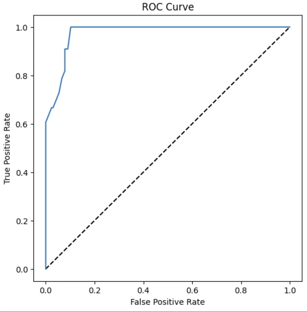
auc = roc_auc_score(y_test,y_scores[:,1])
print(auc)


Comments